skip to main |
skip to sidebar
It's been a very, very, very long time since I last did one of these, so let's stop pussyfooting around and get straight to it.

We start off with what has to be one of the absolute worst movie posters of all time: a flat, non-threatening image posted on Instagram. How do you do, fellow kids!

It's an average animated film poster but I put this in the spotlight due to the sheer fact that the voice actors of the titled characters are fifth and sixth behind four actors kids will have no interest in hearing (save for former Disney star Bella Thorne).

Look everyone, somebody's trying to replace the teal and orange color scheme! And that woman's push-up bra is being pushed out!

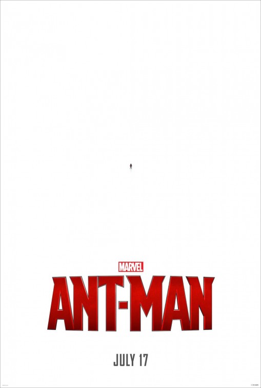
Boom! Striking image, barely overcoming a possible copyright claim. Fantastic tagline. Informs us of the star, writer and director. Thank you.

It's very sad that this Wondercon exclusive poster for the upcoming Turtles sequel is a complete lie. The Turtles don't look this cool at all.

Oh no... somebody ruined my light switch... was it ghosts? Seriously, this teaser is awful.

By "Last to Die", you mean when this movie is the lowest earning new release come August, right? It looks like a third-rate Nathan Drake cosplayer was badly photoshopped in another pointless remake.
A bunch of posters have come out in full force, so let's look at a few of them.

A "new vision", huh? Yeah, right. I don't know what I dislike more about this teaser: The fact that the marketers removed any mention of it being a remake of the horror classic; the inclusion of the eye-rolling, standard verbiage of "From The ____"; or eschewing the classic imagery of the static television, in favor of a plain shadowy figure hiding in the closet.

No, no, no, no, no, no, no! This is so very wrong on so many levels. Plus, it's even more worst than the modern kids' movie practice of subbing out expletives in the marketing, aka "#SmurfHappens" or "What the Shrek Happened?"

Finishing up this trilogy of characters refusing to look forward, we have this lame joke. Get it, the poster is an advertisement for a comedy sequel while also itself being a sequel to a much more funnier teaser poster! What I hate the most about this poster, however, is that the visual gag was already used during the promotion of the now-legendary bomb A Million Ways to Die in the West.

In terms of poster art featuring a play on the words of "Coming Soon", I feel this one is not only better than Ted 2, but more refreshingly frank.

Looks more like a John Woo film that a sequel to a YA adaptation that everyone begrudgingly went to and quickly forgot about.

Ryan Gosling's directorial debut returned to the main spotlight this week, when the trailer and poster premiered online. Though I'm still a bit concerned about the movie after the harsh notices it received at Cannes last year, this poster is an amazing blend of nightmare fuel and fantasy.

I'm still looking forward to seeing the film but this is just an ugly design that is far from being hilarious.

Pretty standard banal poster for a Liam Neeson action film. I only highlight this simply because I feel that it straight up shows us that not only is Neeson the new Bronson but he's starting to morph into him.

Well, I will be totally fine, still living up in the North, and maybe hanging out with some family members. No cause for concern.

And we finish up this edition with what has to be the early frontrunner for Worst Movie Poster of 2015. Mexican posters for American comedies tend to generate the absolutely horrendous visuals to be crafted by unskilled hands and a bad version of Photoshop. Look no further than last year's Walk of Shame or the infamous monstrosity for Chef. This poster for Tom McCarthy's The Cobbler can now join this Hall of Shame, with its terrible use of perspective, a neck-breaking enabriated Adam Sandler, and the stone old gag of a comedian wearing lady footwear.
Man, I haven't done one of these since May. Oh well, what can do? Now then, let's check out some posters for movies coming out this year.

I was giving out on this during my winter movie season article and I can't stop my ire. The movie will surely bomb hard this weekend, even more so that Blackhat's $4 million premiere pull. Seriously, who would see this poster (including kids) in the lobby and honestly say, "Yes, I want to see this nondescript, ugly troll movie."

I agree with everyone else: this is a pretty awesome teaser.

Now, I'm still not won over by this found footage horror movie, but this poster is bold. It cleverly informs you of the key plot points while also retaining the film's dark view at the internet age and the sociology of teenagers online.

A great twist on the fairly generic Truman Show model.

This poster had many nerds salivating, solely because of the presence of Freddy's Power Gloved Glove from Freddy's Dead: The Final Nightmare. It's boyishly cool but after you sit through the trailer, you will begin to hate seeing this poster again.

Ah, another terribly photoshopped poster for a Hollywood comedy. What's wrong with Tom Wilkinson? What's Dave Franco looking at? Also, we can tell there are on a business trip because they are wearing suits and Franco is carrying around a backpack. Why did you need to include a giant airplane? Why couldn't you just bring the European background far more forward?

Trying to invoke horror movie posters of yesteryears a la Rosemary's Baby, it's severely undercut by the prominent PG-13 rating and the boring Twitter handle. And what is with the "U"?

Pretty damn striking. It will certainly win for Best Twitter Handle for a Movie come next January.

The movie is sure to be terrible but I just absolutely love this and the other variants.

A great creation, even though it's more Spielbergesque than the next big movie from Christopher Nolan.

This will certainly be hung up in every little boy's room for the rest of the year.

After two great posters for their previous entries, the V/H/S series now has their first dud.

On one hand, it's yet another generic Marvel poster: overstuffed with characters, random explosions and dismay, etc. On the other, it clearly states to the public, "THIS IS THE NEW AND BETTER STAR WARS YOU WANTED!"

I'm totally confused. The first sentence of the tagline proclaims this will be an "animals goes wild" flick, but then the next sentence says it's a corrupt cop movie, but then the poster image labels it as a were-hyena horror film. Make up your mind!

Way too vague and the paper rip outline tells us nothing. Makes the movie look like an indie remake of The Shining.

A brave yet clever design.

Unless you're British, you'll think this poster is for a feature length adaptation of the Peanut-Butter-Jelly-Time! meme. Nice of them to steal Mike Barton's pro-wrestling slogan for the twitter marketing.

This Japanese variant is far more effective, far more terrifying than the standard American poster.

What the hell is wrong with Cage's head?! He looks like the waiting room voodoo guy in Beetlejuice. Also, the background people look mildly perturbed that the "Rapture" is happening.

This is the character poster that the MPAA "banned" from public displays in the last couple of days, much to the marketing happiness of The Weinstein Company. Nothing you haven't seen before, let alone in comic books.

Thanks to this poster, I'm going to believe the movie ends with a tight close-up of the protagonist, as she frets in the back of a car (Guess that movie!).

So the boy from the first movie somehow transformed into a dolphin? I hope he knows that dolphins are sex maniacs, carry STDs, and like to eat the young.

Why that stupid face? And what the hell is with the clouds?!

Tells you the body count, tells you the villain, and throws you through a loop with the auteur credit. Simply good.

So, this made the rounds online today.
I'm not as big of a fan for Jem when compared to Hasbro's other big toy show, G.I. Joe, but I've always understood the appeal of the alternative Barbie/pre-Hanna Montana character and I get a kick of its weird New Wave mythos and nostalgia. This poster is striking but already makes me feel like the fan-generated, quickly adapted film will be in the same incorrect vein as the Josie and The Pussycats movie, i.e. taking the music way too serious and being post-grunge instead of, you know, pop and/or rock. Let's wait and see what director Jon M. Chu has for the fans once the trailer comes out.

Damn you, Godzilla marketing team! Not only do you craft another masterful piece but you made it a SXSW-only exclusive.

Gee Disney, Black Swan much?

Ladies and gentlemen, the best film poster of 2014. Simply ravishing.

Yesterday, Dr. Will Caster also believed that the truth can be adjusted, your future has been adjusted, and that this will be the most terrifying film you will ever experience.

That battle of course being his struggle to overcome his vertigo affliction and defeating Graviton.

...the hell?

You need to sell the public on accepting a western film, desperately trying not to have it bomb at the box office like the others, and the poster you came up is the protagonist holding up a sheep? It was nice of Seth MacFarlane to hire Paris Hilton's long-lost older sister to pose as Charlize Theron.

Dios Mios! How could they get any worst after Walk of Shame's American poster? Elizabeth Banks' head has been entirely replaced so she can look more stoned out of her gourd, speeding cars and buildings(?) have been added, and her dress have been treated to the absolute worst photoshopping I have ever seen. Has there ever been a bus bench placed AWAY from traffic?

Nice 80's horror throwback styling and a clever visual gag.

All hail King Optimus Prime! Simply badass.